You have worked hard to increase traffic to your website. Now, you want more people to buy your product or service. How do you do this? You optimise your call to actions.
In this article, I’m going to share a few tips on how to optimise your call to actions.
1. No Generic Words
The first thing you need to do is not use generic words. Things like “Buy Now” aren’t too effective. “Try me,” again, not too effective. The call to action text needs to be related to your product and service.
If your text aligns with the benefit that the consumer is going to get, they’re much more likely to convert.
2. Optimise Hero Image
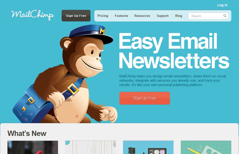
Number two, you have images on your site. Make sure that hero image, that main image, is looking at your call to action. It is drawing attention to it.

So, for example, if you have an image of a person or teddy bear in this instance, the eyes should be looking to the call to action. It shouldn’t be looking at you, the website visitor.
This way, people subconsciously know to draw their attention to the call to action instead of the image.
3. Time Sensitive Words
Third thing you need to do is add time sensitive words. “Try now,” “Free trial,” and again, it needs to be related to your product or service.
So if you’re selling marketing services, “Grow your traffic today” is related to the benefit, the solution you’re providing, as well as that encourages people to get started right away as opposed to taking their time.
4. Placement of Call to Action
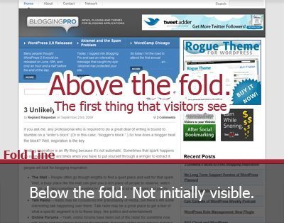
Last but not least, make sure you’re placing your call to actions in the right places on your website. You don’t want to just place it at the bottom of your website. You don’t want to just place it above the fold either. It should be placed where it makes sense.

If above the fold you have a video that explains your product or service, underneath there should be a call to action.
If then your page goes over features and services and why people should use you, after you break down each and every single feature, you can also have a call to action that lets people know that they can get started.
As you describe the benefits of your product and service, you should continually place your call to action buttons beneath them.
Have them sprinkled throughout your page so then that way, people don’t have to keep scrolling or down to click on them.
So in conclusion, if you don’t use generic words, optimise the hero image, use time sensitive words and place your call to action in the right places, you will see an increase in conversions.
If I have missed any strategies, let me know. I’ll add it to the article. What other call to action strategies have worked for you?


